
Cali Games E-Commerce Website Responsive Redesign
Background
During this 2 Week Sprint, I had the opportunity to explore local e-commerce stores that either had outdated designs or barely had an online presence. After a short period of researching, I stumbled upon Cali Games, a local video game store. The website that the store currently had was in desperate need of a redesign, as it was cleary quite outdated. The e-commerce portion of the website was not available as well, so I figured it would be a great opportunity for me to implement it as well.
It was clear that the website needed an overhaul from the ground up, which is why I chose to pursue this specifc website as the focus of this project. I additionally developed responsive, mobile screens of key screens, which I translated into a high-fidelity, mockup.
Role
UX Designer | UX Researcher
Team
Solo Conceptual Project
Timeline
Sept 2021 - Oct 2021 | 2-Week Sprint
Methods and Approach
User Research, Personas, Card Sorting, Site Map, Task Flows, Competitive Analysis, Wireframing, Usability Testing, Prototyping, Mockups, Responsive Design, Developer Handoff
The Problem
Cali Games's current website is barely functional and does not provide users any sort of information about the actual products it sells, leaving them confused and unhappy. How can I redesign the current website to satisfy the needs of the users and ensure that they leave the website happy and satisfied with their purchase?
01) Research
The Current Website
While many businesses have transitioned to have more of an online presence, especially because of the pandemic, Cali Games has quite struggled in this aspect. The store currently requires customers to directly call the store to check the availability of items, which can be quite the inconvenience for consumers. This is further accentuated by the lack of images and videos of the products the store currently has in stock, which is arguably some of the most important factors to consider for video game enthusiasts.
Additionally, there were quite a number of UI issues present all over the website, which made the store confusing to navigate.
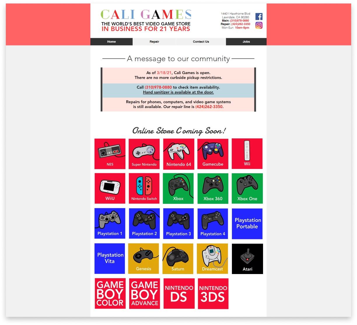
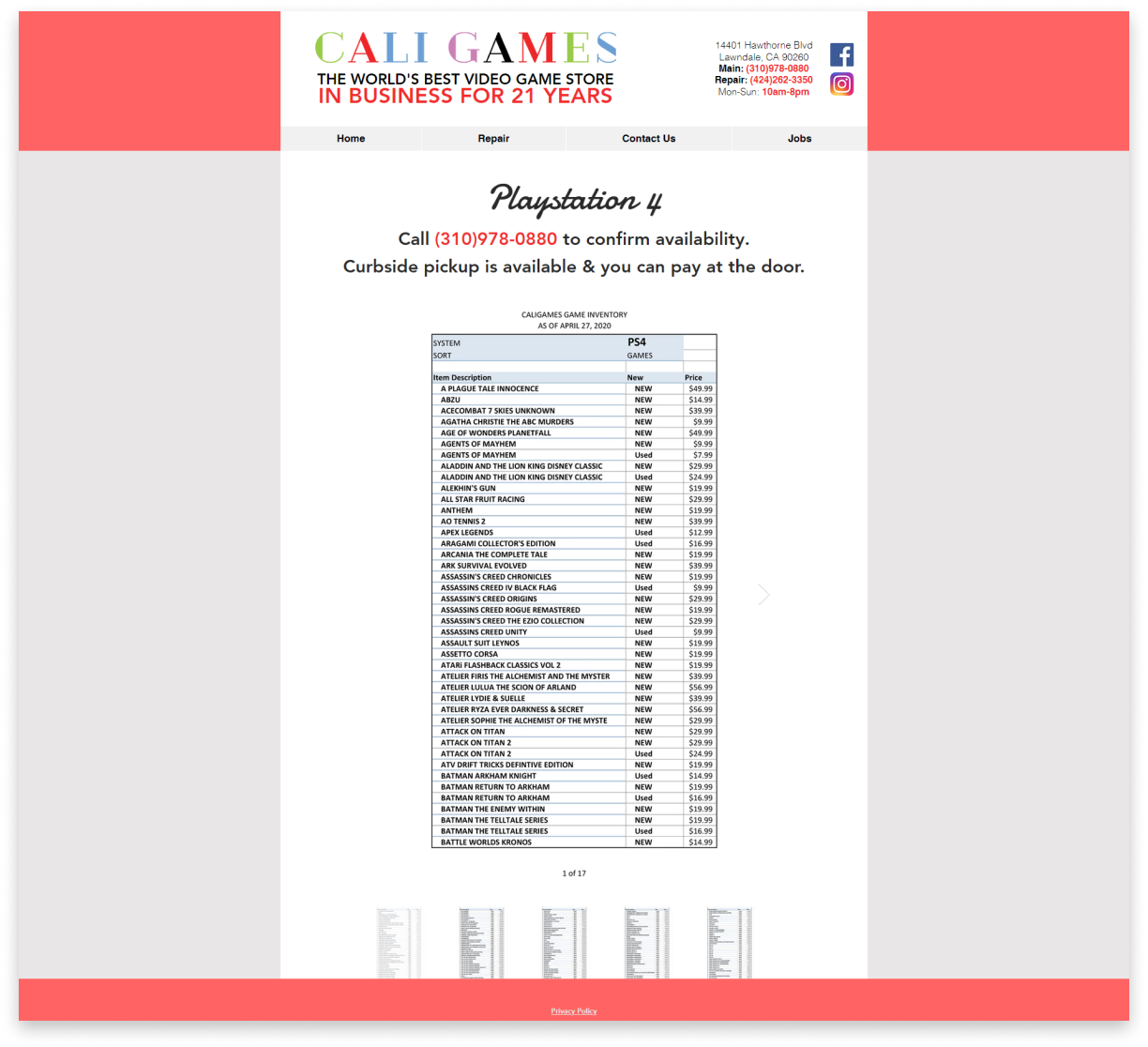
Customers are forced to call the store directly, as the e-commerce section of the store is not available yet.
There are no images of the products the store currently carries; hundreds of products are listed by name only.
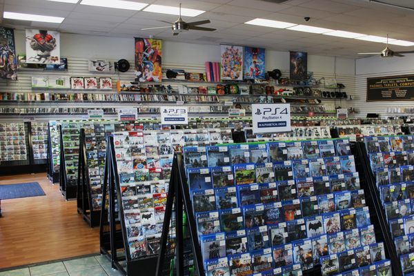
Exploring the Store... In Person
Additonally, I decided to personally visit the store myself to to get a better grasp of the store's inventory. I was able to really explore and see all the video games the store had to offer, and the pricing they had on each game. Since they were a more local store, I noted that the owners also made their products cheaper than the standard prices found on the bigger retailers, which was part of the store's appeal.
The store also carried a lot more games than I expected, which made me begin to question the scale of the website I was trying to redesign. As a result, I began to think about the ways to best categorize these items.
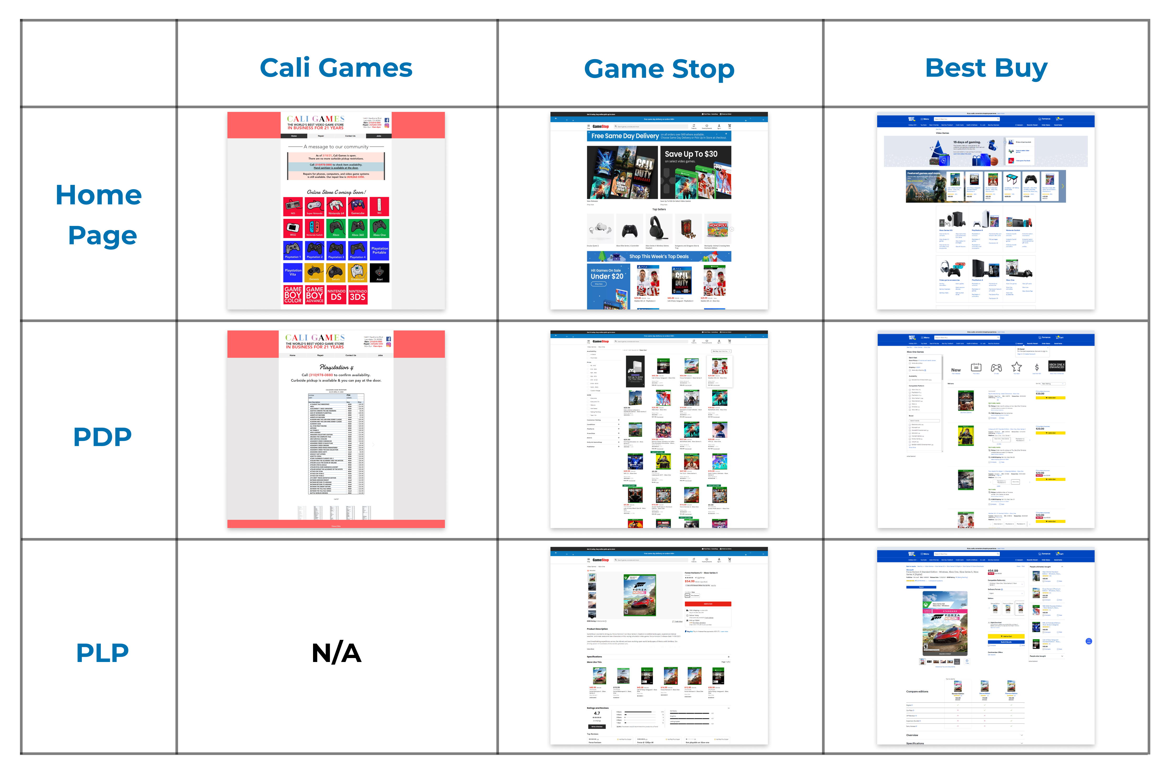
Competitive Analysis: What are other E-Commerce Stores doing?
Additonally, I wanted to look at more established websites that sold video games to grasp a better sense of what particular features and components they used throughout the entire shopping and checkout experience. In particular, I looked at the websites for Best Buy and Gamestop.
By analyzing these competing sites , I was able to generate some great ideas and gather some inspiration that would help me greatly when I began to redesign Cali Games. I also gained a greater sense of visual patterns and standard e-commerce practices I should implement.
Finding and Interviewing my Target Audience
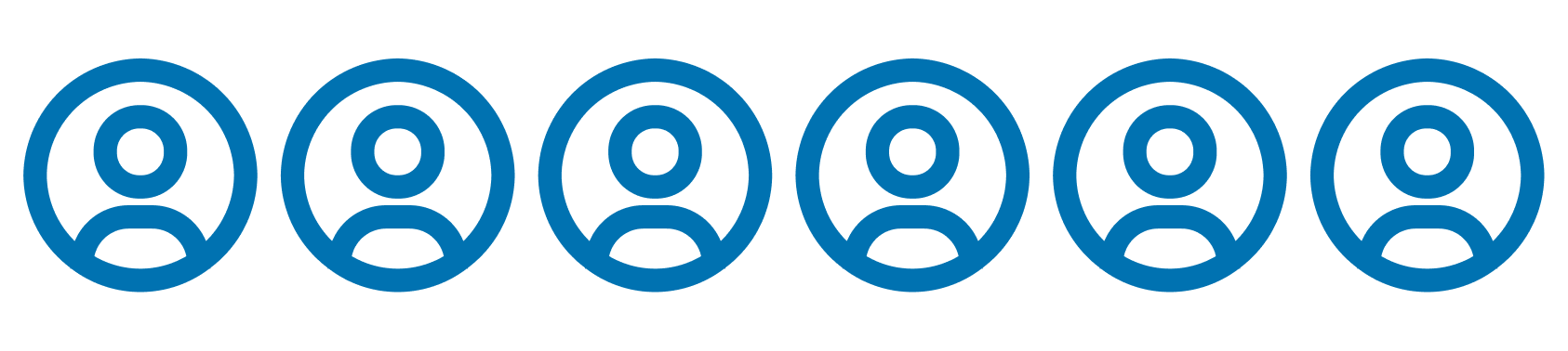
I conducted interviews with 6 individuals who were interested in video games and had bought them through e-commerce stores. I aimed to discover what behaviors, needs, and pain points users had about their shopping experience. I also conducted brief usability tests with the websites I looked at during my competitive analysis to discover what highlights and pain points each user had with each website as well. I then consolidated my findings into an affinty map, which helped me discover 4 insights and trends that existed amongst the majority of the users I interviewed, which I transformed into "I Statements."
Key Findings
I want to see big images and gameplay videos of the games I am viewing, which help me finizalize my purchase decision.
I want to be able to clearly see the price, publisher, product description, and have the ability to access and sort reviews when viewing a specific game.
I want to easily search for and access games that are on specifically sale, new, and recommended for them.
I want to be able to filter games by console, genre, franchise, and price to help me when I am browsing the store's inventory.
02) Define
Establishing My Target Audience
With the information and findings I obtained from my user interviews, I developed two personas, Damian and Vincent, who both wanted a seamless purchasing and checkout experience as they shop for games. Their particular needs, however, do differ a bit.

Damian

Vincent
Damian needs a better and seamless way to find the specific game he is considering to buy and access all of its relevant information.
Goals:
- Search for games based on his console and genre he's interested in
- Have a seamless search and checkout experience
Pain Points:
- Having to sift through so many different games
- Using confusing and redundant filters, leading to a diffcult search process.
Vincent needs an easy way to sort and find the cheapest games on sale, as well as access in-depth reviews of the games he's looking at.
Goals:
- Play games that he's interested in, while fitting in his budget
- Wants to be frugal with his money, given his current financial difficulties
Pain Points:
- Sometimes having diffculty finding games on sale
- Finding that reviews are not in-depth as he wants them to be.
03) Ideating
Redefining the Information Architecture
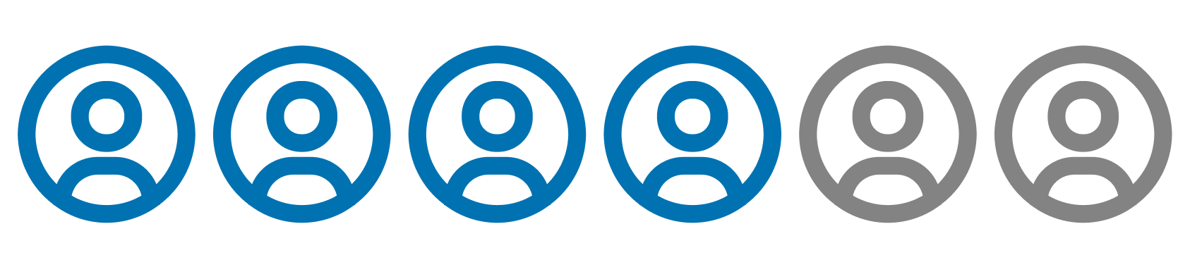
I wanted to grasp a better sense of the categories that intuitively made sense for users as they shopped for video games. To achieve this, I performed two different open card sorts, one to determine what categories that users grouped consoles together with, and another to determine the genres that users were most familiar with.
These excercises helped me ideate how to revamp the current information architecture that Cali Games currently employs. I ran these particular card sorting activites with 7 users, and discovered the following categories.
Console Categorizations: Video Game Genres:
• Xbox • Retro • Sports • Action/Adventure
• Playstation • Casual • Family-Friendly
• Nintendo • RPG • Strategy
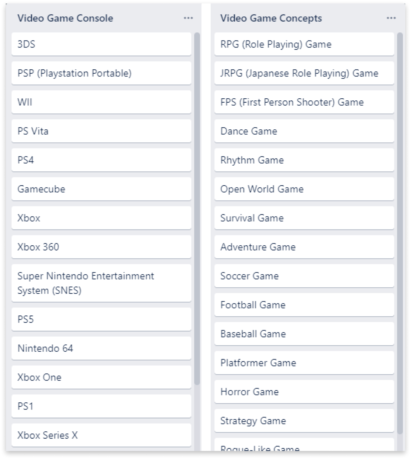
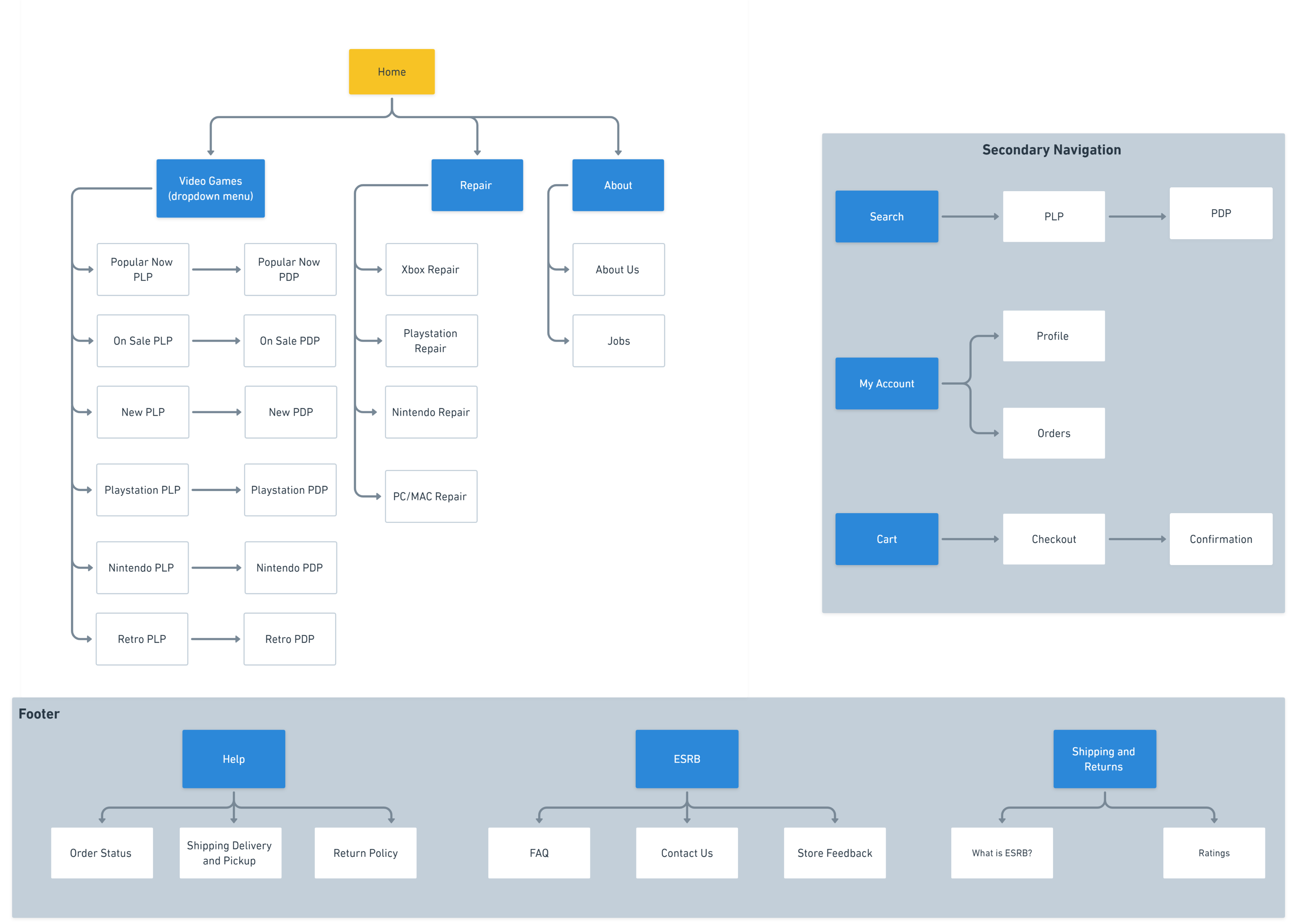
Additionally, by using the results from the card sorting, I was able to develp a site map to help me better understand the type of hierarchy I would want on the website, and have a visual representation of my redesigned website's organization and how different sections would be linked together.
The Solution
Leveraging the knowledge I gained from my user research and ideation, I had a clear idea of what the updated site should have in its e-commerce section. The redesigned Cali Games website provides users with a updated and functional video game e-commerce store that allows users to:
01) Look at the type of games they want to view, like games that are new, popular now, and on sale.
02) Search for, filter, and sort the inventory of games available to find the one that best matches their preference.
03) Access all the information about the game, and then seamlessly checkout and purchase the game.
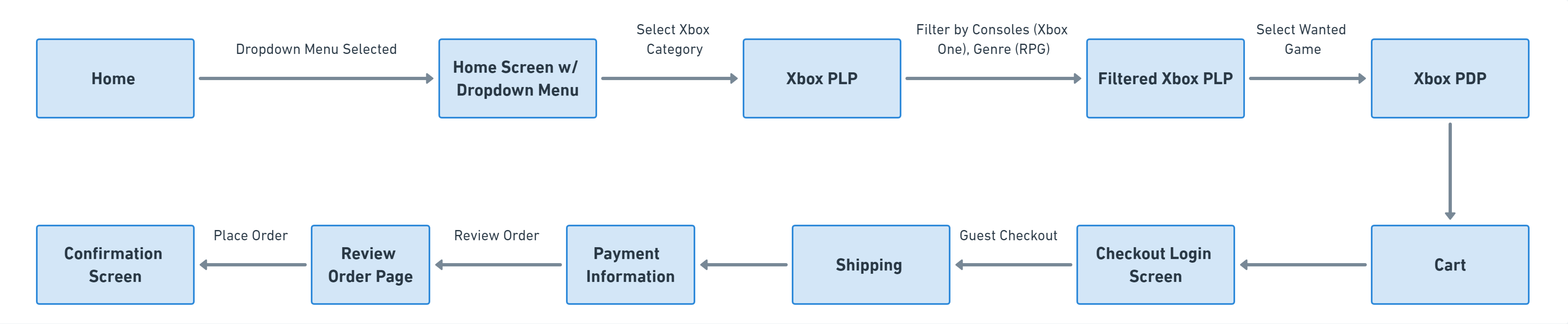
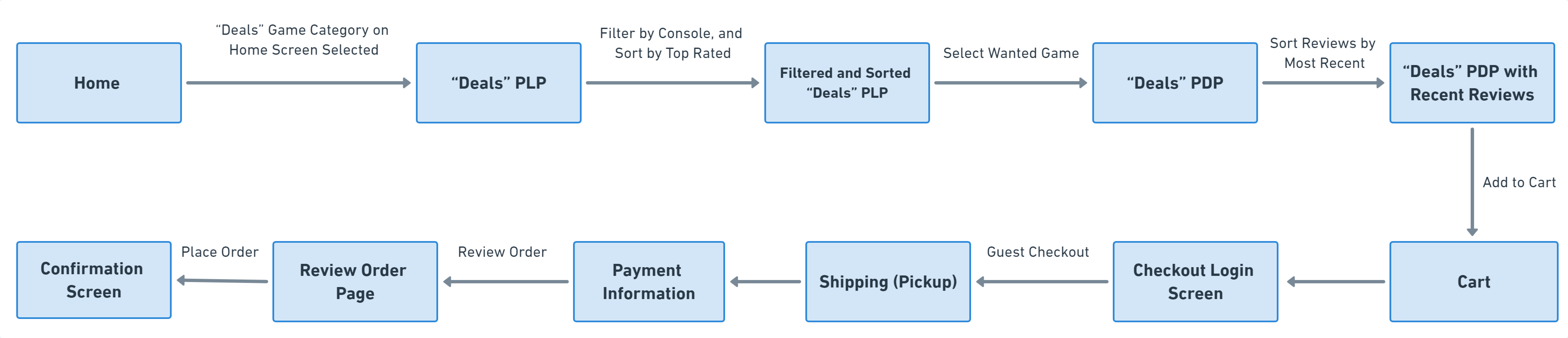
Using these guidelines, I also brainstormed 2 task flows that would represent the tasks that my personas, Vincent and Damian, would undergo as they navigated the site, which helped me as I designed the website.
Damian's Task Flow
Vincent's Task Flow
04) Design
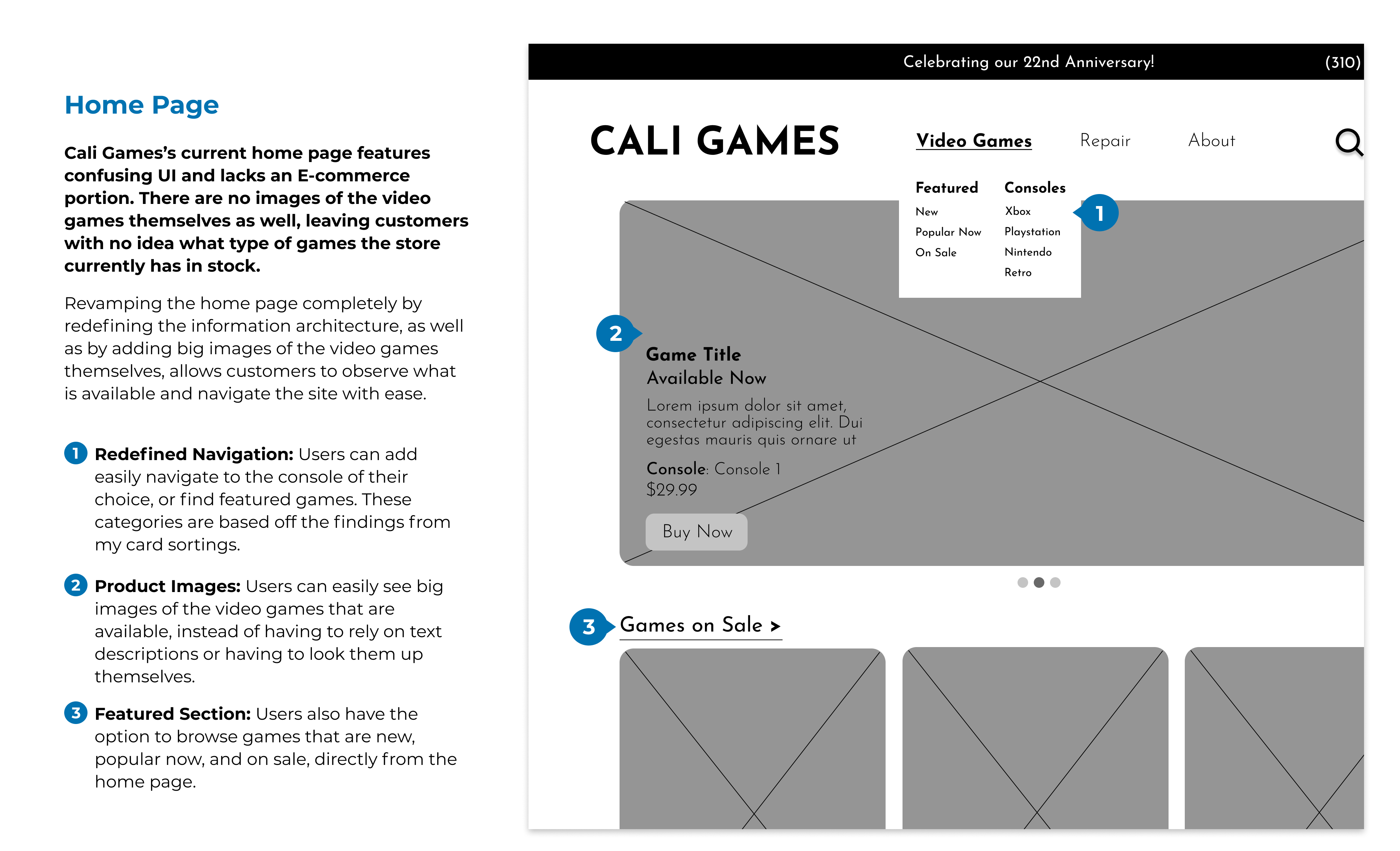
(re)Designing the Website
As I began to sketch and design my low-fidelity wireframes, I made sure to be as meticulous as possible, keeping the needs of my personas, Damian and Vincent, in my head as I executed my design decisions. I made sure that the redesign would include:
01) Wide availability of images and gameplay of video games all throughout the website, which let users know more about the games themselves
02) Intuitive Navigation, based on my findings from Card Sorting and the Site Map, allowing users to easily navigate to where they need to
03) Search, Sort, and Filter options to help users narrow down their search and find the game that best fits their preferences
04) Easily accessible, in-depth information about each game, prioritzing what the users want to know most about, as well as a review section to see what other people say about a game
I also wanted to maintain the retro "feel" of the store and its products as much as possible well. With these guidelines set, I began the process of creating my wireframes in Figma. Below are some of the key pages I designed.
05) Testing
Iterating on the Design
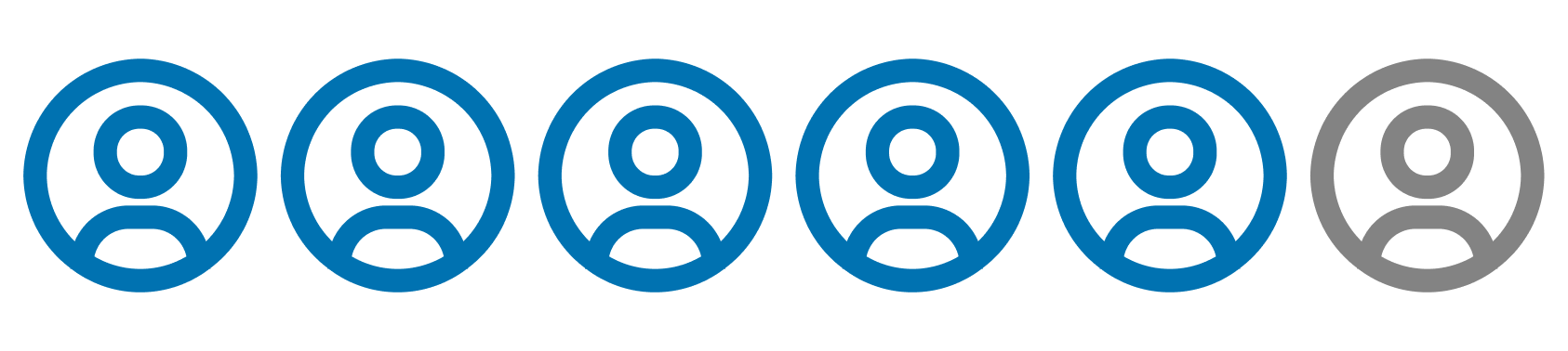
To test the validity of my design, I decided to run usability tests to assess where parts of the experience made sense for users, and where things didn't make as much sense. I reached out to 2 members of my target audience, and made them walk through the same tasks of my established personas. I then made sure to incorporate the feedback I found and itereate on my design.
Being Able to Navigate Backwards
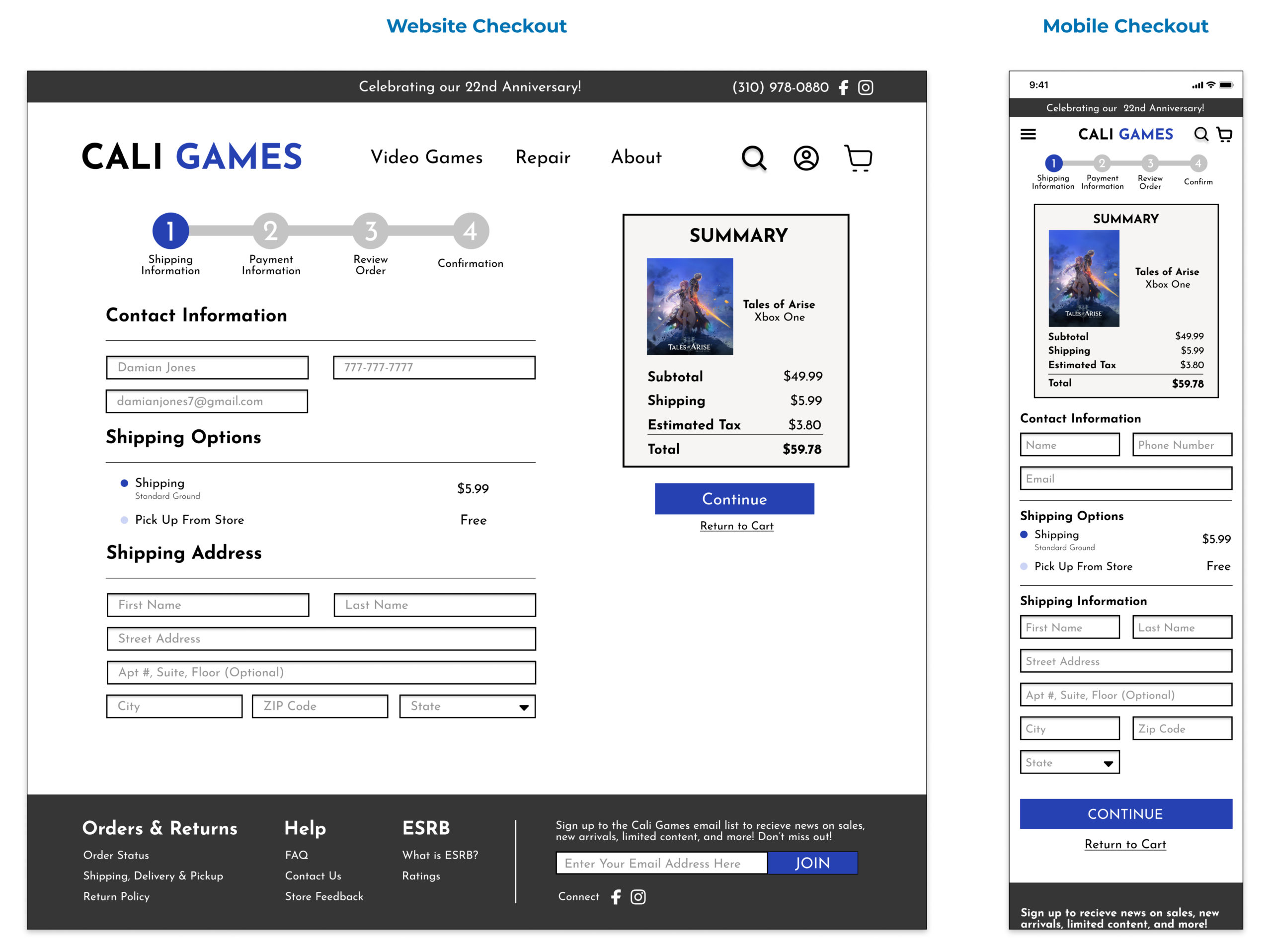
There was no method to allow users to go back throughout the checkout process, which would not give them the options to edit any changes they want to make until the "Review Order" screen.
As a result, I added hyperlink text throught the entire checkout process that allows users to go back and make edits if necessary.
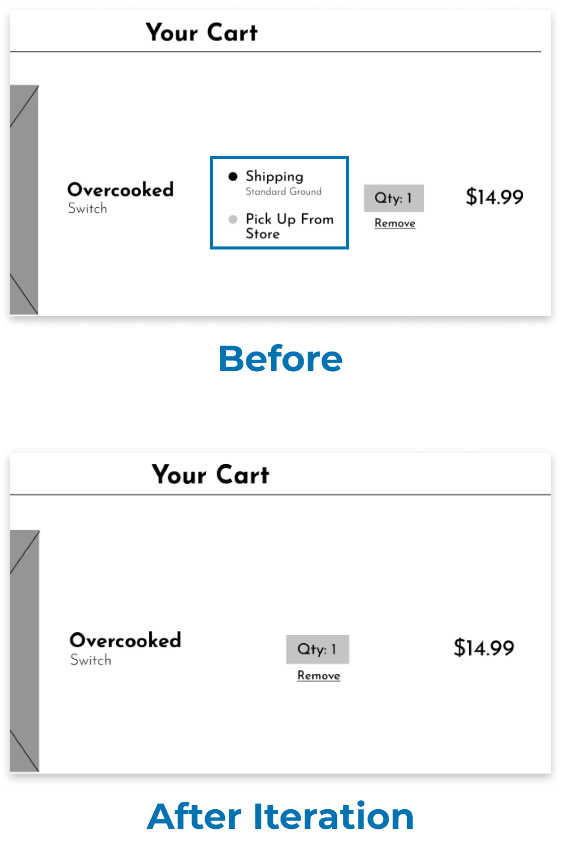
Redundant Shipping Selection
There were two times where users could have a chosen a shipping option (Cart and Shipping Information Screen), which they felt was a bit confusing and redundant.
Therefore, I removed the shipping selection from the Cart screen to reduce any confusion in the user's shipping and checkout process.
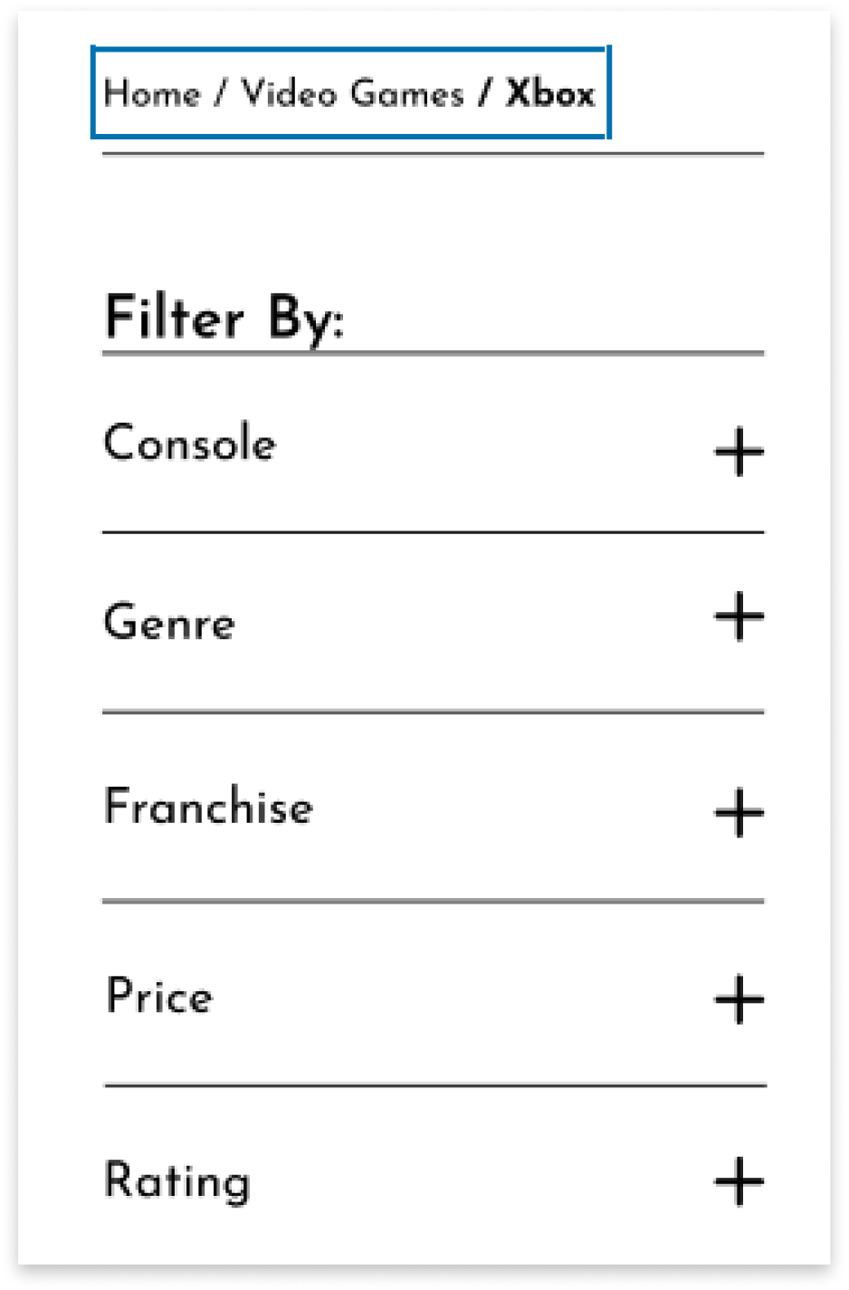
Adding Breadcrumbs
Users mentioned that it would be really helpful to see what stage they are at as they navigate through the website.
As a result, I added breadcrumbs as an aid to help users understand where they are at as they use the website and access different pages.
06) Prototype
Building Hi-FI Mobile Responsive Pages
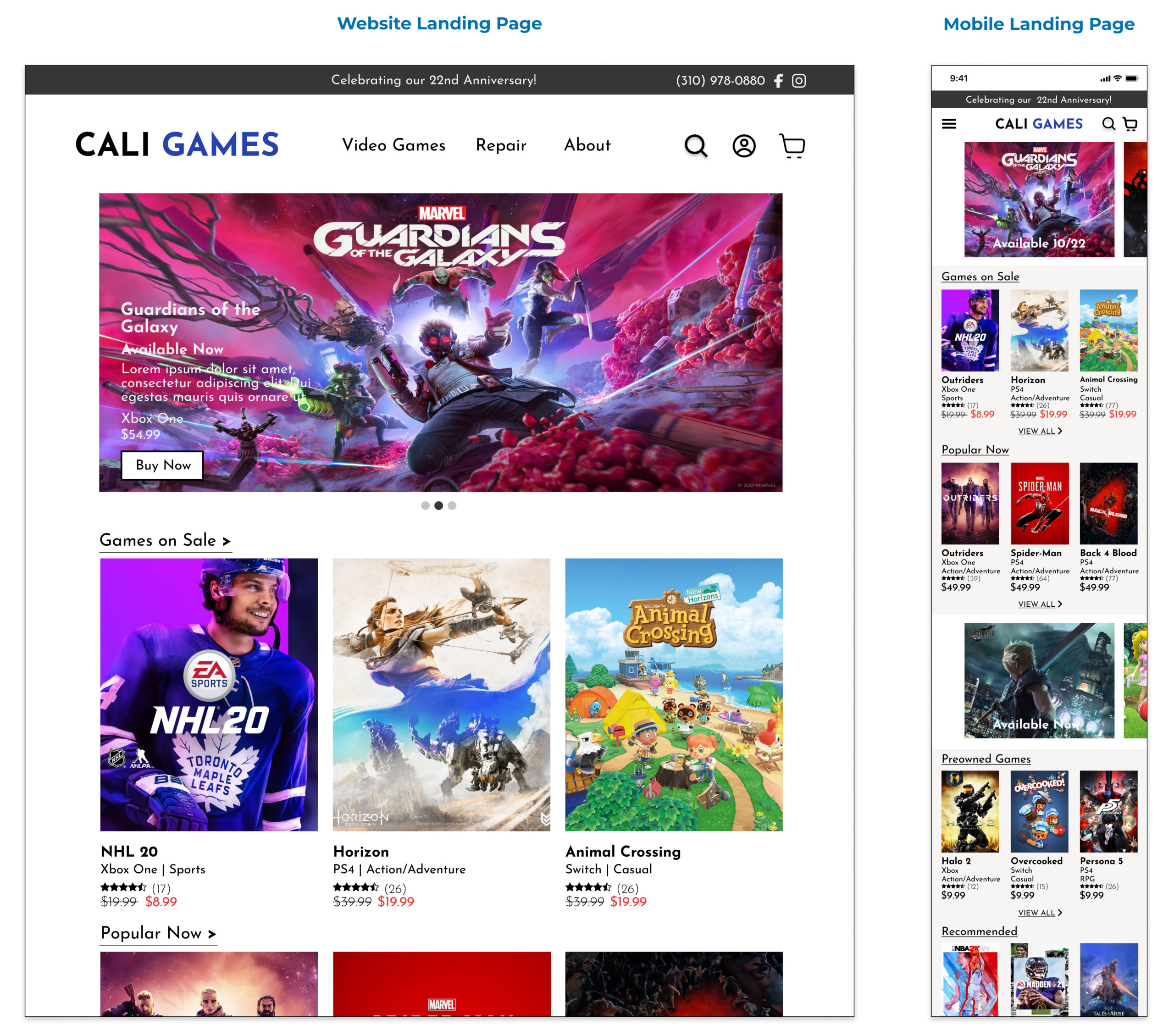
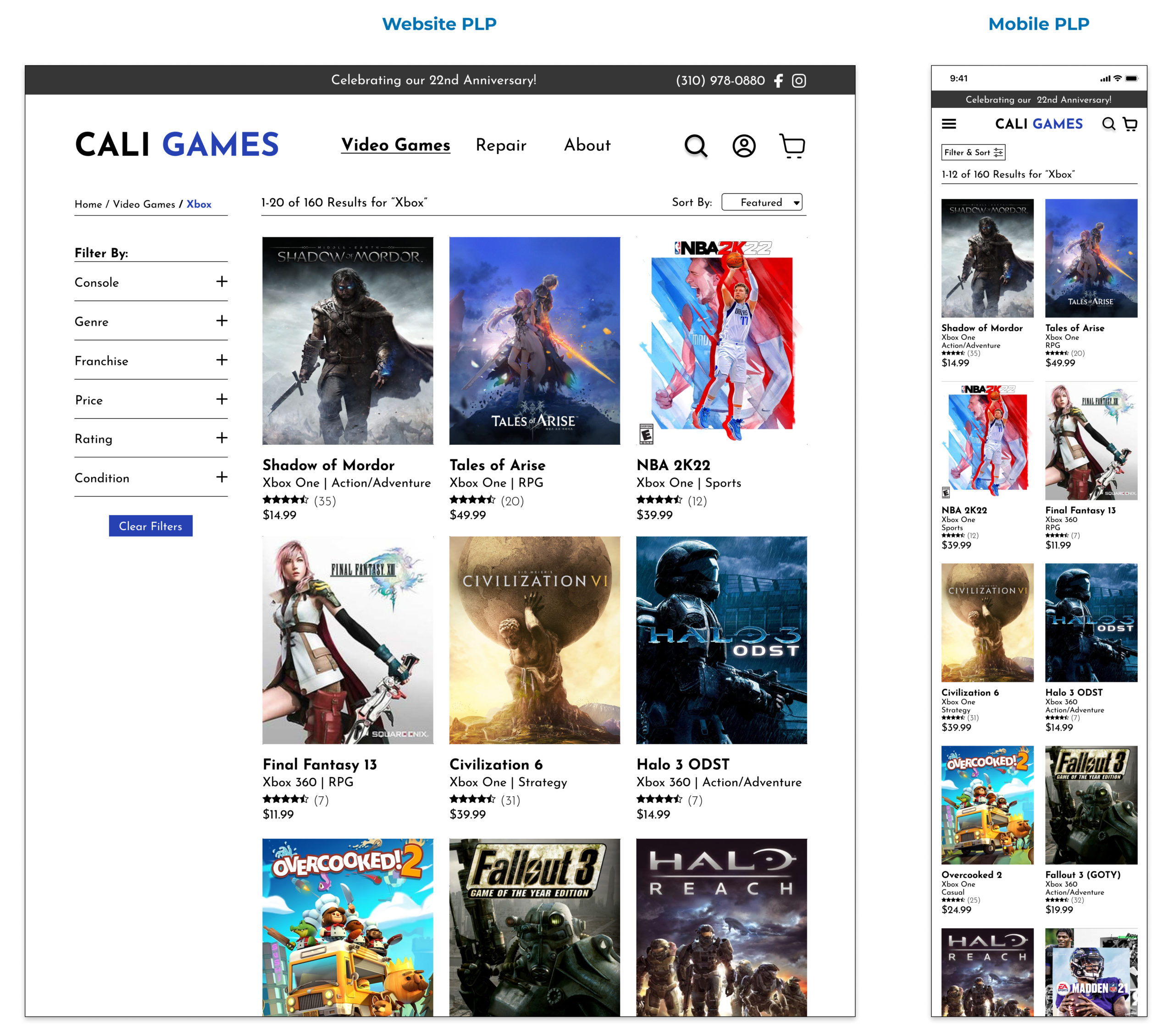
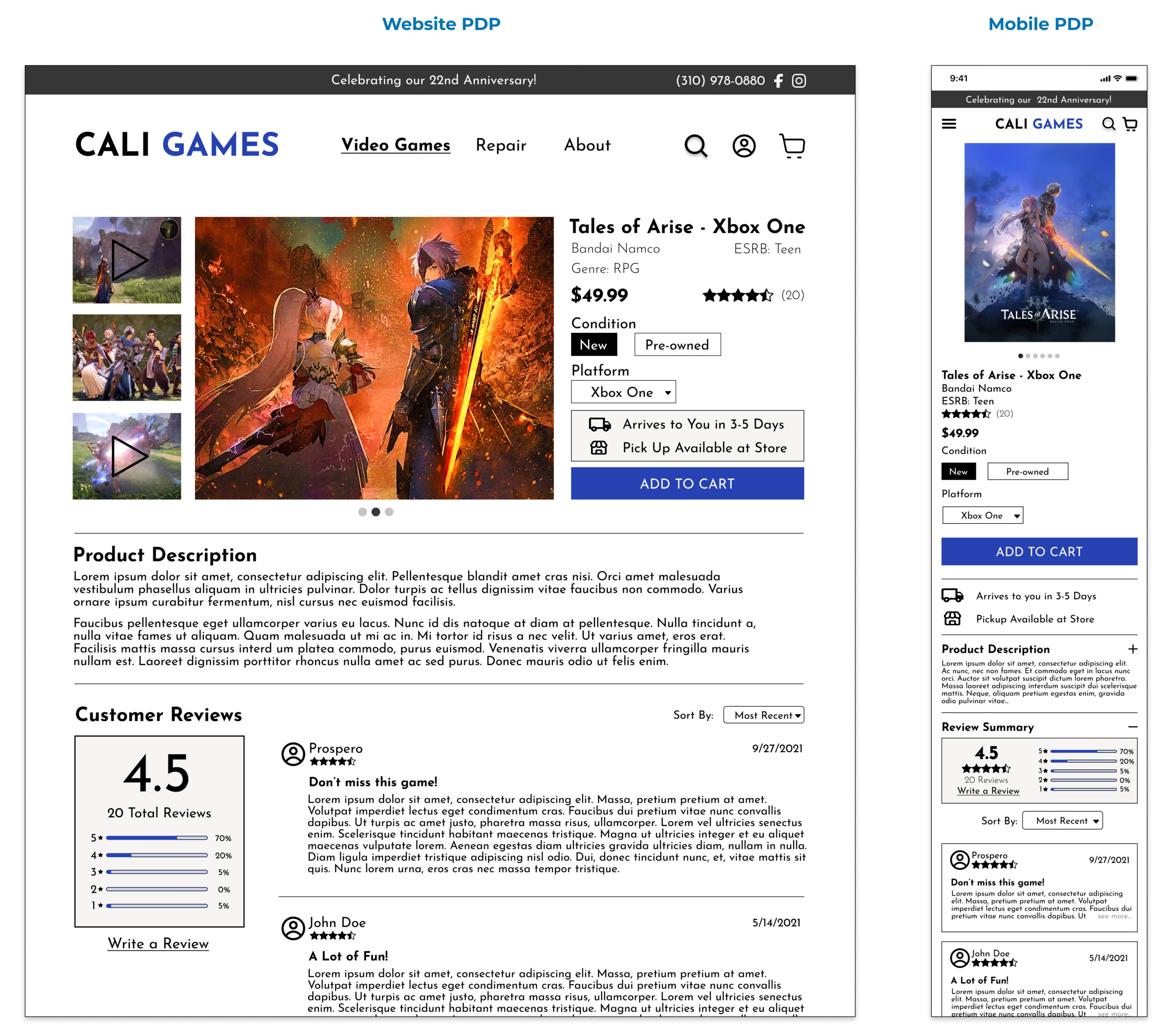
When I originally began this project, I came in with the mindset of delivering a MVP of a website as a priority, as the original website needed so much work to begin with. I then translated 4 key screens from my original wireframes to be mobile responsive, which is something that I would love to keep iterating on with the rest of my screens. I then further refined these sceens into a high-fidelity, mockup filled with images of video games and color.
When accounting for mobile responsiveness, I made sure to prioritize the most important features, adjusted text styles, and condensed navigational/filter menus to provide consumers an intuitive experience while on a mobile phone.
Reflection
This project was a challenging yet fulfilling process for me. I was able to redesign an e-commerce website from the ground up, without using any pre-existing resources, which is something that I would ever have imagined doing. I had a great time learning all the intricacies that goes into designing a functional e-commerce site, and I'm glad that it was for a type of product I personally love, video games! It was also challenging to discover how I could translate my original website pages into mobile design, but I'm satisfied that I was able to create appropriate design systems for both.
Next Steps
As I mentioned previously, I would love to continue translating the rest of the web pages I designed into mobile screens. I also would want to implement a way for users to add video games to a wishlist and access those bookmarked items in the future, as it would save time and provide even more convenience for consumers to find games they are interested in.